轩枫阁V3主题开发-重构篇
前言
轩枫阁V3主题已上线,本文将介绍本站V3主题关于CSS重构的内容。兼容IE9+,主要看Chrome表现。
LESS
鉴于Less能满足本站主题开发的需求,就没有更换成Sass。Less介绍:http://www.lesscss.net/
mixins
基于 Less的 CSS代码片段复用和混入库,主要有圆角border-radius、渐变gradient、内阴影inner-shadow、阴影box-shadow、动画animation、transition、宽度计算calc-width、省略text-overflow等,代码见附录。
滚动条
网站针对滚动条的展现进行了优化,表现及代码如下:
::-webkit-scrollbar {
    width: 8px;
    height: 8px
}

::-webkit-scrollbar-thumb {
    border-radius: 4px;
    -moz-border-radius: 4px;
    -webkit-border-radius: 4px;
    background-color: #aaa;
}

::-webkit-scrollbar-track {
    background-color: transparent
}
动画
为了更好的性能,本站将JS动画转为CSS3动画。一些动画效果摘自animate.css,使用到的效果如fadeIn、fadeInDown、fadeInUp、fadeOut、zoomIn、zoomOut、flipInY等 效果。
构建
开发部署使用的构建工作流是tmt-workflow,介绍文章:tmt-workflow前端工作流。
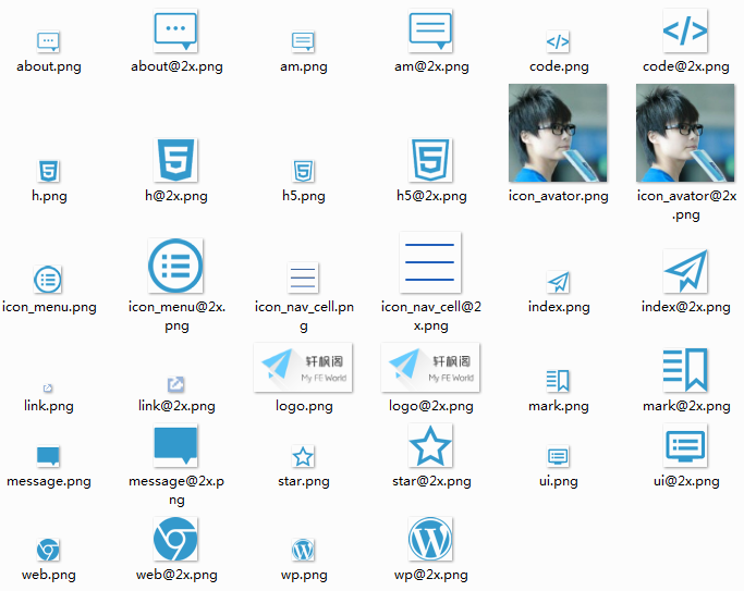
雪碧图及2x图
使用雪碧图Sprite,将各图标合并成一张图。
开发过程中,使用单个图标,结合tmt-workflow,在发布时将图片合并。
若图片支持 @2x,可以命名为 icon-xx@2x.png 放入 slice目录,合并后会加入 media query。
// 构建前
.icon-word {
    background-image: url('../slice/icon-twitter.png');
}
// 构建后-2x图
@media only screen and (-webkit-min-device-pixel-ratio: 2),
       only screen and (min--moz-device-pixel-ratio: 2),
       only screen and (min-resolution: 240dpi) {
    .icon-word{
        background-image:url("../sprite/style-index@2x.png");
        background-position: 0px 0px;
        background-size:132px;
    }
}
图片压缩
图标、大图、配图、内容图在制作的过程中,可以在PS中,使用快捷键Ctrl+Shift+Alt+S,保存为Web可用格式。半透明图一般选择PNG24,其它图片(色彩丰富)一般保存为质量为高的JPG格式图。
除了文章图,其它图片可以通过tmt-workflow构建,将图片进行压缩。PNG图片的压缩率一般在40%,JPG的压缩率一般在20%。
静态HTML
WP主题开发时,一般是先开发调试好静态页面,再将HTML拆分成PHP文件。
模块化
引入模块:@import
CSS模块:将页面各部分木块拆分到CSS文件如 mod-header.less、mod-sidebar.less、mod-footer.less等
生产环境文件:style-*.less 为样式的出口文件,程序只编译 style- 开头的 Less 文件,其余文件可认为是import 在出口文件里面的模块,如 mod-header 模块
BEM
简介
BEM:http://bem.info
BEM自称是前端开发方法论(Frontend Development Methodology),提供了包括命名规则、CSS/JS模块化原则在内的一套用于开发环节的方法。
优点
- 团队协作中样式命名(比如
class)冲突 - 用长
class名解决,不使用结构化选择器,类名自带层级关系 - 实现代码自己会说话(
self-documenting code)的目标 - 语义化类名,提供更多的信息,例如元素名、功能、所属组件名等
- 避免组件之间相互影响
- 不依赖结构化选择器,全靠类名
定义
Block + Element + Modifier
Block:逻辑和页面功能都独立的页面组件,是一个可复用单元Element:Block的组成部分,依赖Block存在Modifier:定义Block和Element的外观及行为
对比
BEM before
.list {}
.list .item {}
.list .icon {}

<ul class="list">
    <li class="item">
        <em class="icon"></em>
    </li>
    <li class="item"></li>
    <li class="item"></li>
</ul>
BEM after
.mod-list {}
.mod-list__item {}

<ul class="mod-list">
    <li class="mod-list__item">
    <span class="mod-list__icon"></span>
    </li>
    <li class="mod-list__item"></li>
    <li class="mod-list__item"></li>
</ul>
BEM 修饰符
命名规则:block-name__element-name_mod-name
<!--before-->
.list{}
.list.select{}
.list .item{}
.list .item.active{}

<!--now-->
.mod-list{}
.mod-list_select{}
.mod-list__item{}
.mod-list__item_active{}
BEM 的各种横线
- - 中划线 :仅作为连字符使用
- __ 双下划线:双下划线用来连接块与⼦元素
- _ 单下划线:单下划线用来描述一个块或者块的子元素的一种状态
附录
lib-mixins.less
//----------------------------
//
//  mixins.less v0.1.5
//  http://mixinsless.com/
//  Reuse snippets & Cross-browser private properties snippets.
//----------------------------

// Border radius with the same argument
// -------------------------
.rounded(@radius: 3px) {
  -webkit-border-radius:@radius;
  -moz-border-radius:@radius;
  border-radius:@radius;
  -webkit-background-clip:padding-box;
  -moz-background-clip:padding-box;
  background-clip:padding-box;
}

// Border radius with different arguments
// -------------------------
.border-radius(@topleft: 0, @topright: 0, @bottomright: 0, @bottomleft: 0) {
  -webkit-border-top-left-radius:@topleft;
  -webkit-border-top-right-radius:@topright;
  -webkit-border-bottom-right-radius:@bottomright;
  -webkit-border-bottom-left-radius:@bottomleft;
  -moz-border-radius-topleft:@topleft;
  -moz-border-radius-topright:@topright;
  -moz-border-radius-bottomright:@bottomright;
  -moz-border-radius-bottomleft:@bottomleft;
  border-top-left-radius:@topleft;
  border-top-right-radius:@topright;
  border-bottom-right-radius:@bottomright;
  border-bottom-left-radius:@bottomleft;
  -webkit-background-clip:padding-box;
  -moz-background-clip:padding-box;
  background-clip:padding-box;
}

// Background size
// -------------------------
.background-size(@size) {
  -webkit-background-size:@size;
  -moz-background-size:@size;
  -o-background-size:@size;
  background-size:@size;
}

// Opacity
// -------------------------
.opacity(@opacity) {
  opacity:@opacity;
  @opacityIE : @opacity * 100;
  filter:~"alpha(opacity=@{opacityIE})";
}

// Appearance
// -------------------------
.appearance(@appearance:none) {
  -webkit-appearance:@appearance;
  appearance:@appearance;
}

// Gradient
// -------------------------
.gradient(@start: #000000, @stop: #FFFFFF) {
  background:(@start + @stop)/2;
  background:-webkit-gradient(linear, left top, left bottom, color-stop(0, @start), color-stop(1, @stop));
  background:-moz-linear-gradient(center top, @start 0%, @stop 100%);
}

// Box shadow
// -------------------------
.drop-shadow(@horizontal: 0, @vertical: 1px, @blur: 2px, @alpha: 0.1) {
  -webkit-box-shadow:@horizontal @vertical  @blur rgba(0, 0, 0, @alpha);
  -moz-box-shadow:@horizontal @vertical  @blur rgba(0, 0, 0, @alpha);
  box-shadow:@horizontal @vertical  @blur rgba(0, 0, 0, @alpha);
}

// Box shadow inset
// -------------------------
.inner-shadow(@horizontal: 0, @vertical: 1px, @blur: 2px, @alpha: 0.4) {
  -webkit-box-shadow:inset @horizontal @vertical @blur rgba(0, 0, 0, @alpha);
  -moz-box-shadow:inset @horizontal @vertical @blur rgba(0, 0, 0, @alpha);
  box-shadow:inset @horizontal @vertical @blur rgba(0, 0, 0, @alpha);
}

// Box inner border
// -------------------------
.inner-border(@width: 1px, @color: #000) {
  -webkit-box-shadow:inset 0 0 0 @width @color;
  -moz-box-shadow:inset 0 0 0 @width @color;
  box-shadow:inset 0 0 0 @width @color;
}

// Box shadow default
// -------------------------
.box-shadow(@arguments) {
  -webkit-box-shadow:@arguments;
  -moz-box-shadow:@arguments;
  box-shadow:@arguments;
}

// Animation
// -------------------------
.animation(@animation) {
  -webkit-animation:@animation;
  -moz-animation:@animation;
  animation:@animation;
}

.transition(@transition) {
  -webkit-transition:@transition;
  -moz-transition:@transition;
  -o-transition:@transition;
  transition:@transition;
}
.transition-delay(@transition-delay) {
  -webkit-transition-delay:@transition-delay;
  -moz-transition-delay:@transition-delay;
  -o-transition-delay:@transition-delay;
  transition-delay:@transition-delay;
}
.transition-duration(@transition-duration) {
  -webkit-transition-duration:@transition-duration;
  -moz-transition-duration:@transition-duration;
  -o-transition-duration:@transition-duration;
  transition-duration:@transition-duration;
}

// Transform
// -------------------------
.transform(@arguments) {
  -webkit-transform:@arguments;
  -moz-transform:@arguments;
  transform:@arguments;
}

// Transform rotation
// -------------------------
.rotation(@deg:5deg) {
  -webkit-transform:rotate(@deg);
  -moz-transform:rotate(@deg);
  transform:rotate(@deg);
}

// Transform scale
// -------------------------
.scale(@ratio:1.5) {
  -webkit-transform:scale(@ratio);
  -moz-transform:scale(@ratio);
  transform:scale(@ratio);
}

// Translate
// -------------------------
.translate(@x:0, @y:0) {
  -moz-transform:translate(@x, @y);
  -webkit-transform:translate(@x, @y);
  -o-transform:translate(@x, @y);
  -ms-transform:translate(@x, @y);
  transform:translate(@x, @y);
}

// Translate3d
// -------------------------
.translate3d(@x, @y, @z) {
  -webkit-transform:translate3d(@x, @y, @z);
  -moz-transform:translate3d(@x, @y, @z);
  -o-transform:translate3d(@x, @y, @z);
  transform:translate3d(@x, @y, @z);
}

// Background clipping
// -------------------------
.background-clip(@clip) {
  -webkit-background-clip:@clip;
  -moz-background-clip:@clip;
  background-clip:@clip;
}

// CSS columns
// -------------------------
.columns(@colwidth: 250px, @colcount: 0, @colgap: 50px, @columnRuleColor: #EEEEEE, @columnRuleStyle: solid, @columnRuleWidth: 1px) {
  -moz-column-width:@colwidth;
  -moz-column-count:@colcount;
  -moz-column-gap:@colgap;
  -moz-column-rule-color:@columnRuleColor;
  -moz-column-rule-style:@columnRuleStyle;
  -moz-column-rule-width:@columnRuleWidth;
  -webkit-column-width:@colwidth;
  -webkit-column-count:@colcount;
  -webkit-column-gap:@colgap;
  -webkit-column-rule-color:@columnRuleColor;
  -webkit-column-rule-style:@columnRuleStyle;
  -webkit-column-rule-width:@columnRuleWidth;
  column-width:@colwidth;
  column-count:@colcount;
  column-gap:@colgap;
  column-rule-color:@columnRuleColor;
  column-rule-style:@columnRuleStyle;
  column-rule-width:@columnRuleWidth;
}

// Import font
// -------------------------
.font-face(@fontFamily, @fileName, @style, @weight) {
  @font-face{
    font-family:@fontFamily;
    font-style:@style;
    font-weight:@weight;
    src:url('@{fileName}.eot');
    src:local('@fontFamily'), url('@{fileName}.eot?#iefix') format('embedded-opentype'), url('@{fileName}.woff') format('woff'), url('@{fileName}.ttf') format('truetype'), url('@{fileName}.svg#@{fontFamily}') format('svg'), url("@{fileName}.otf") format('opentype');
  }
}

// Clearfix
// -------------------------
.clearfix() {
  zoom:1;
  &:before{
    content:'';
    display:block;
  }
  &:after{
    content:'';
    display:table;
    clear:both;
  }
}

// CSS image replacement
// -------------------------
// Source: https://github.com/h5bp/html5-boilerplate/commit/aa0396eae757
.hide-text() {
  font:0/0 a;
  color:transparent;
  text-shadow:none;
  background-color:transparent;
  border:0;
}

// Force line breaks
// -------------------------
.word-break() {
    word-break:break-all;
    word-wrap:break-word;
    white-space: normal;
}

// No wrap
// -------------------------
.no-wrap() {
    word-break: normal;
    word-wrap: normal;
    white-space: nowrap;
}

// Text overflow with(...)
// -------------------------
// Requires inline-block or block for proper styling
.text-overflow() {
  overflow:hidden;
  text-overflow:ellipsis;
  white-space:nowrap;
  max-width:100%;
}

.line-overflow(@line) {
  overflow:hidden;
  text-overflow:ellipsis;
  display:-webkit-box;
  -webkit-line-clamp:@line; /* number of lines to show */
  -webkit-box-orient:vertical;
}

// Creates a wrapper for a series of columns
// -------------------------
.lay-row() {
  // Negative margin the row out to align the content of columns
  margin-left:  (@grid-gutter-width / -2);
  margin-right: (@grid-gutter-width / -2);
  // Then clear the floated columns
  .clearfix();
}

// Generate the columns
// -------------------------
.lay-column(@columns) {
  @media (min-width: @grid-float-breakpoint) {
    float: left;
    // Calculate width based on number of columns available
    width: percentage(@columns / @grid-columns);
  }
  // Prevent columns from collapsing when empty
  min-height: 1px;
  // Set inner padding as gutters instead of margin
  padding-left:  (@grid-gutter-width / 2);
  padding-right: (@grid-gutter-width / 2);
}

// Generate the column offsets
// -------------------------
.lay-column-offset(@columns) {
  @media (min-width: @grid-float-breakpoint) {
    margin-left: percentage((@columns / @grid-columns));
  }
}

// Alpha background
// -------------------------
.alpha-background(@rgb:#000,@alpha:.5){
  @rgba-color:fade(@rgb,@alpha*100);
  @argb-color:argb(@rgba-color);
  background-color:@rgba-color;
  filter:~"progid:DXImageTransform.Microsoft.gradient(startColorstr='@{argb-color}', endColorstr='@{argb-color}', GradientType=0)\9";
  zoom:1;
}

// Controls the selection model of an element.
// -------------------------
.user-select(@arguments:none){
  -webkit-user-select: @arguments;
  -moz-user-select: @arguments;
  -ms-user-select: @arguments;
  user-select: @arguments;
}

// Flexbox display
// -------------------------
// flex or inline-flex
.flex-display(@display: flex) {
  display: ~"-webkit-@{display}";
  display: ~"-moz-@{display}";
  display: @display;
}


// calc
.calc-width(@percent: 100%, @sub: 10px, @width: 100%){
    width: @width; /* Fallback for browsers that don't support the calc() function */
    width: ~"-moz-calc(@{percent} - @{sub})";
    width: ~"-webkit-calc(@{percent} - @{sub})";
    width: ~"calc(@{percent} - @{sub})";
}