IT博客汇
  • 首页
  • 精华
  • 技术
  • 设计
  • 资讯
  • 扯淡
  • 权利声明
  • 登录 注册

    用 matplotlib 画极坐标柱状图

    Hacper\'s Blog发表于 2018-09-10 06:00:45
    love 0

    之前在Learn Python with Steem #10 #11 笔记文章中使用Windrose这个包来画时间频率图,但Windrose叫风玫瑰图,绘制的图是专门用来表示风速和风向的关系的,在风玫瑰图中,用不同的颜色表示风速的大小,而每个扇形的长度表示风向的频率,表示主导风向。用Windrose来表示时间频率有违背风玫瑰图的原意。

    Windrose

    所以直接用 matplotlib 画极坐标柱状图来表示时间频率更合适。


    先导入Python包numpy和matplotlib:

    1
    2
    
    import numpy as np
    from matplotlib import pyplot as plt
    

    编写绘图函数:

     1
     2
     3
     4
     5
     6
     7
     8
     9
    10
    11
    12
    13
    14
    15
    16
    17
    18
    19
    20
    21
    22
    23
    24
    25
    26
    27
    28
    29
    30
    31
    32
    33
    34
    35
    36
    37
    38
    39
    40
    41
    42
    43
    44
    45
    46
    
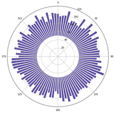
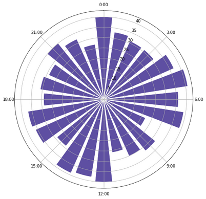
    def make_polar_bar(array_data,
                            edgecolor='white',
                            bottom=0,
                            bins=24,
                            opening=1,
                            ticks=None,
                            figsize=(8, 8),
                            **kwargs):
    
        # 设置扇形的颜色
        facecolor = kwargs.pop('facecolor', None)
        if facecolor is None:
            facecolor = (94 / 255, 79 / 255, 162 / 255)
    
        # 设置每个扇形的间距 2*pi/bins = theta (rad)
        theta = np.linspace(0.0, 2 * np.pi, bins, endpoint=False)
    
        # 统计数据的频次,每个直方的高度
        freq, _ = np.histogram(array_data, bins=bins)
    
        # 设置每个直方的宽度,opening为 0~1,按比例调节直方的宽度
        width = (2 * np.pi) / bins * opening
    
        plt.figure(figsize=figsize)
        ax = plt.subplot(111, polar=True)
        bars = ax.bar(
            theta,
            freq,
            width=width,
            bottom=bottom,
            edgecolor='white',
            facecolor=facecolor,
            **kwargs)
    
        # 设置N方向为起点
        ax.set_theta_zero_location("N")
    
        # 设置旋转方向为顺时针方向
        ax.set_theta_direction(-1)
    
        # 设置标签
        if ticks is None:
            ticks = ['0', '45', '90', '135', '180', '225', '270', '315']
    
        ax.set_xticklabels(ticks)
        plt.show()
    

    测试绘图:

    1
    2
    3
    4
    5
    6
    7
    8
    9
    
    if __name__ == '__main__':
        arr = np.random.randint(0, 100, size=5000)
        make_polar_bar(arr, bins=100, opening=0.8, bottom=50)
    
        ticks = [
            '0:00', '3:00', '6:00', '9:00', '12:00', '15:00', '18:00', '21:00'
        ]
        arr = np.random.randint(0, 24, size=800)
        make_polar_bar(arr, bins=24, opening=0.8, bottom=0, ticks=ticks)
    

    结果:

    blob.jpg

    blob.jpg


沪ICP备19023445号-2号
友情链接