游戏应用中心品牌更新
1. 品牌概述 Brand Overview
游戏应用中心是QQ空间用户专属的游戏平台,最新、最火、最好玩的游戏一网打尽:角色扮演、模拟经营、射击、棋牌、街机、赛车等各类游戏应有尽有。这里网罗了全平台最全、最给力的游戏礼包,更有积分兑换频道、各类精彩活动为玩家提供丰富给力的奖品。
Game&App Center is an exclusive gaming platform for Qzone users including the latest and hottest games such as role playing, simulation, shooting, puzzle, and racing games etc. In Game&App Center, there are most comprehensive and greatest gift packs, points redeem channels and various activities to provide users with abundant prizes.
2. 品牌更新目标 Renewal Goal
游戏应用中心是QQ空间下基于网页的游戏平台。原名“应用中心”,不仅有游戏还有其他应用,所以旧Logo有“APP”字样。随着app的份额减少弱化,应用中心决定把重心放在游戏的部分,因此需要重新设计品牌标志。
Game&App Center is a web-based game platform under Qzone. Its original name was "App center" which means the hierarchy more goes on ‘apps’ and that is why the brand only reveals the word "App”. But now as Game&App Center decided to focus on the GAME side as well, we’ve reveal the logo to have ‘game’ as equal as the ‘app’.
同时,为了让Logo跟SNG的品牌系统保持一致。旧标志产生于SNG品牌系统建立之前,所以有些偏离了系统。
In addition, we also wanted the logo to maintain the consistency of SNG brand system because the original logo had been made before SNG brand system was built.
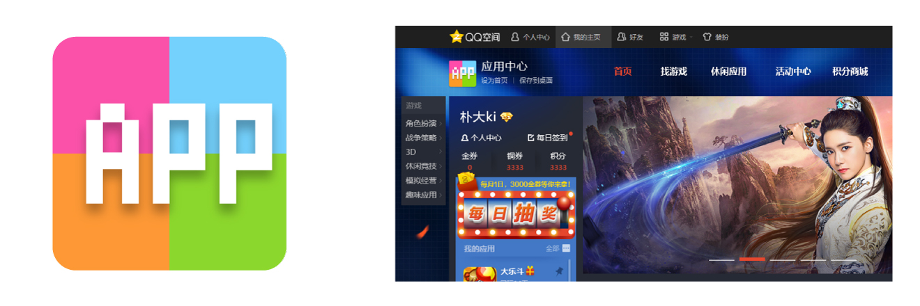
原Logo Original logo
3. 品牌更新过程 Renewal Process
3-1. 创意提炼 Idea sketches
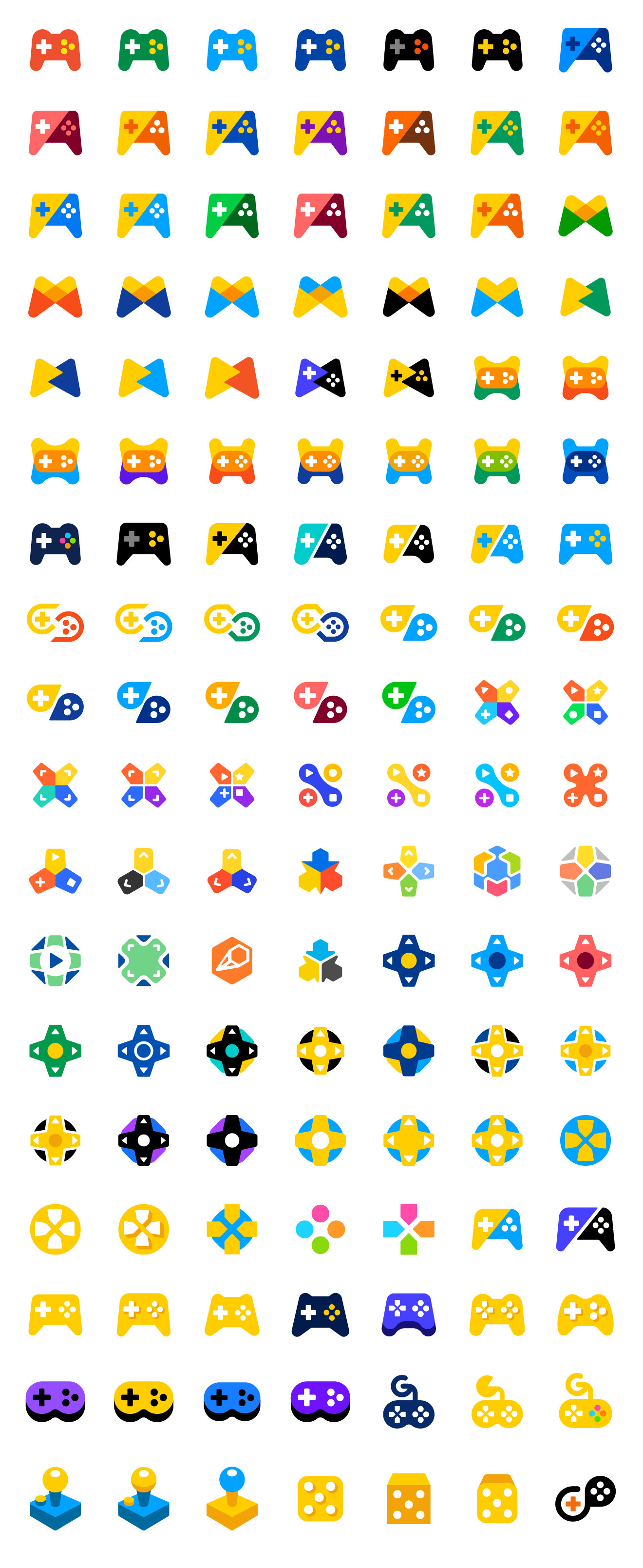
游戏应用中心的新品牌标志需要更有游戏感,创意过程中对游戏元素进行了不同的尝试,尤其是在游戏手柄的方向上不断的演练和简化。在色彩方面,选用鲜亮的颜色组合来制造令人振奋的氛围。
Game&App Center wanted their logo to have much more ‘GAME’ atmosphere. So we studied various icons that is containing gaming element. We focused on gamepad and simplified them after. For the color, we used bright and vivid colors to give an exciting atmosphere.
3-2. 设计提案 Narrow down proposals
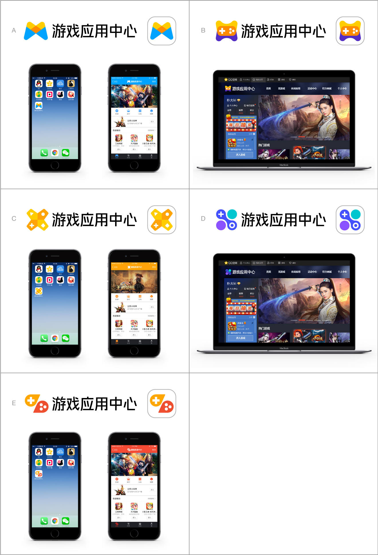
最终从草图演练中筛选出最合适的设计并细化,文字标志则使用SNG Font来维持一致的SNG品牌系统。然后把方案放在游戏应用中心网页和移动端的真实场景中,使方案更清晰、更易于决策。
We chose the most proper proposals among the idea sketches and developed them. For the logotype, we used SNG font to maintain consistency of SNG brand system. And then we simulated them to virtual website and mobile app application to make it easier to see and decide what to choose.
3-3. 最终细化 Final refining
经过几轮商议,我们选用了饱满的B方案图形,提炼了A方案的色彩组合。B方案具有直观游戏元素,而A方案的色彩则更易于让用户联想到QQ空间品牌。对色彩做细微差异的调整后,输出了最终的完整标志。
After several discussions, we mixed proposal B’s shape and proposal A’s color. Proposal B has game elements in shape most obviously and proposal A's color reminds users of Qzone brand easily. After multiple rounds of corrections, Game&App Center’s final logo was decided.

最终Logo Final logo
4. 全新的品牌形象识别系统 New Brand Identity System
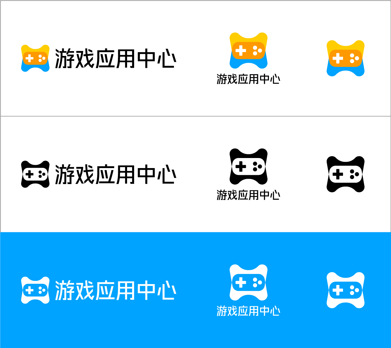
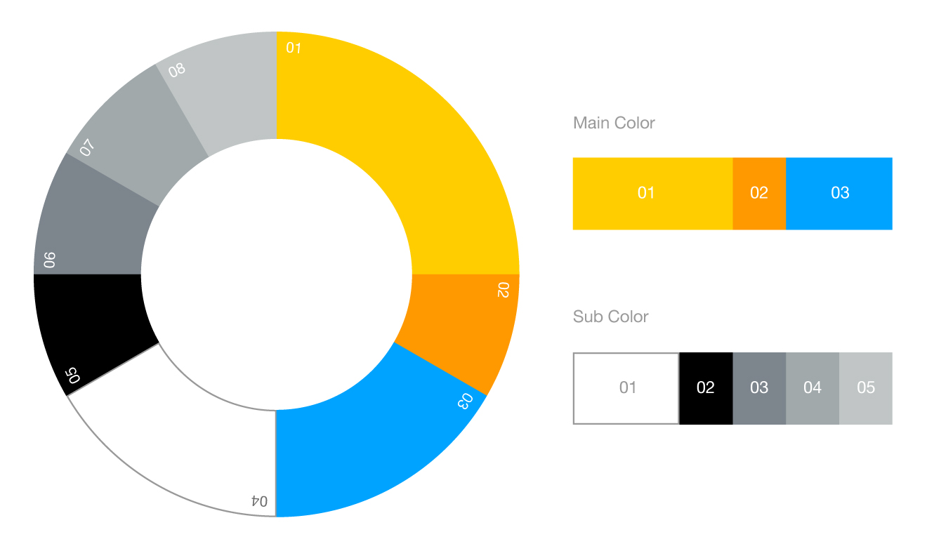
最终标志确定后,我们梳理了游戏应用中心的品牌系统,包括各种应用系统。
After the final logo had been decided, we created whole brand system for the Game&App Center brand including various applications.
4-1. 标志 Logo
4-2. 品牌色 Color
4-3. 品牌应用系统 Applications

5. 标志像素优化 Logo optimization
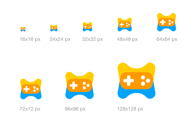
为了让标志在各种尺寸和环境下显示清晰,我们对不同尺寸的标志进行精细到像素的调整。
To make the logo the most clear in any sizes of any circumstances, we’ve adjusted various sizes of logos precisely by pixel.
6. 规范 Guidelines
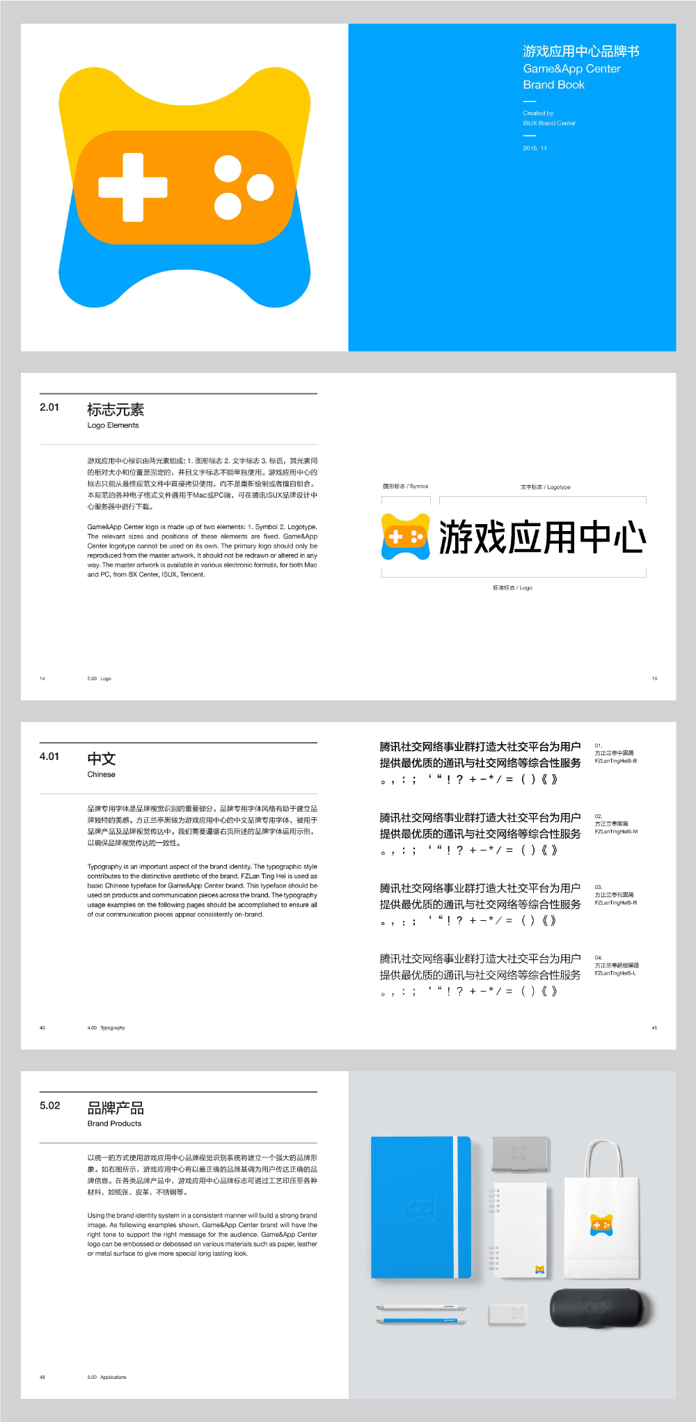
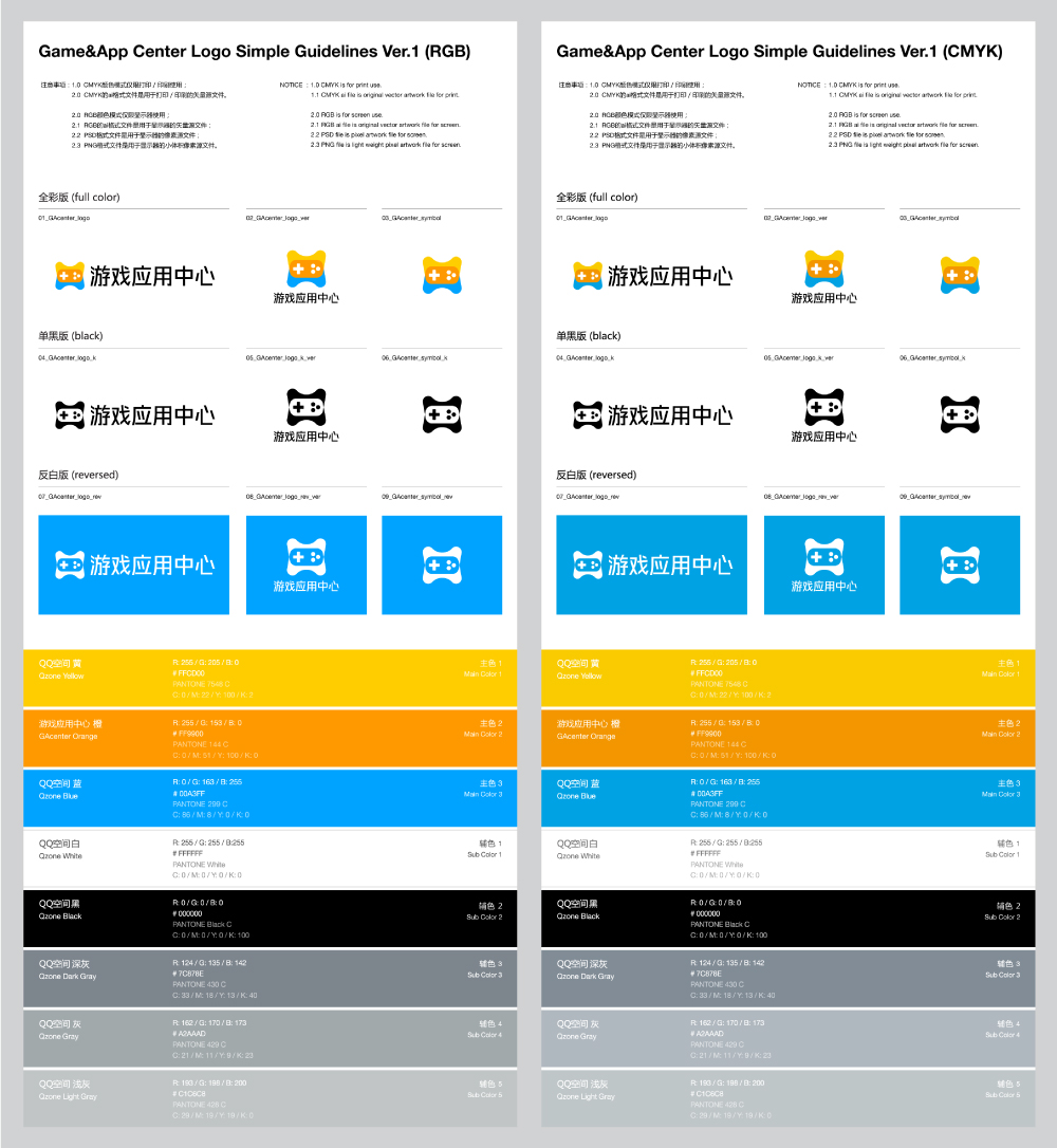
为了让大家更方便和正确地使用游戏应用中心的品牌形象识别系统,我们制定了方便快速使用 Logo 的简单规范,和官方全面的品牌书。
To make everyone related to Game&App Center brand understand its brand identity system easily, we’ve made simple guidelines which is quick and easy to use, and brandbook which is the official guidelines with detailed information.
6-1. 简单规范 Simple guideline
6-2. 品牌书 Brandbook
